Moving Matter
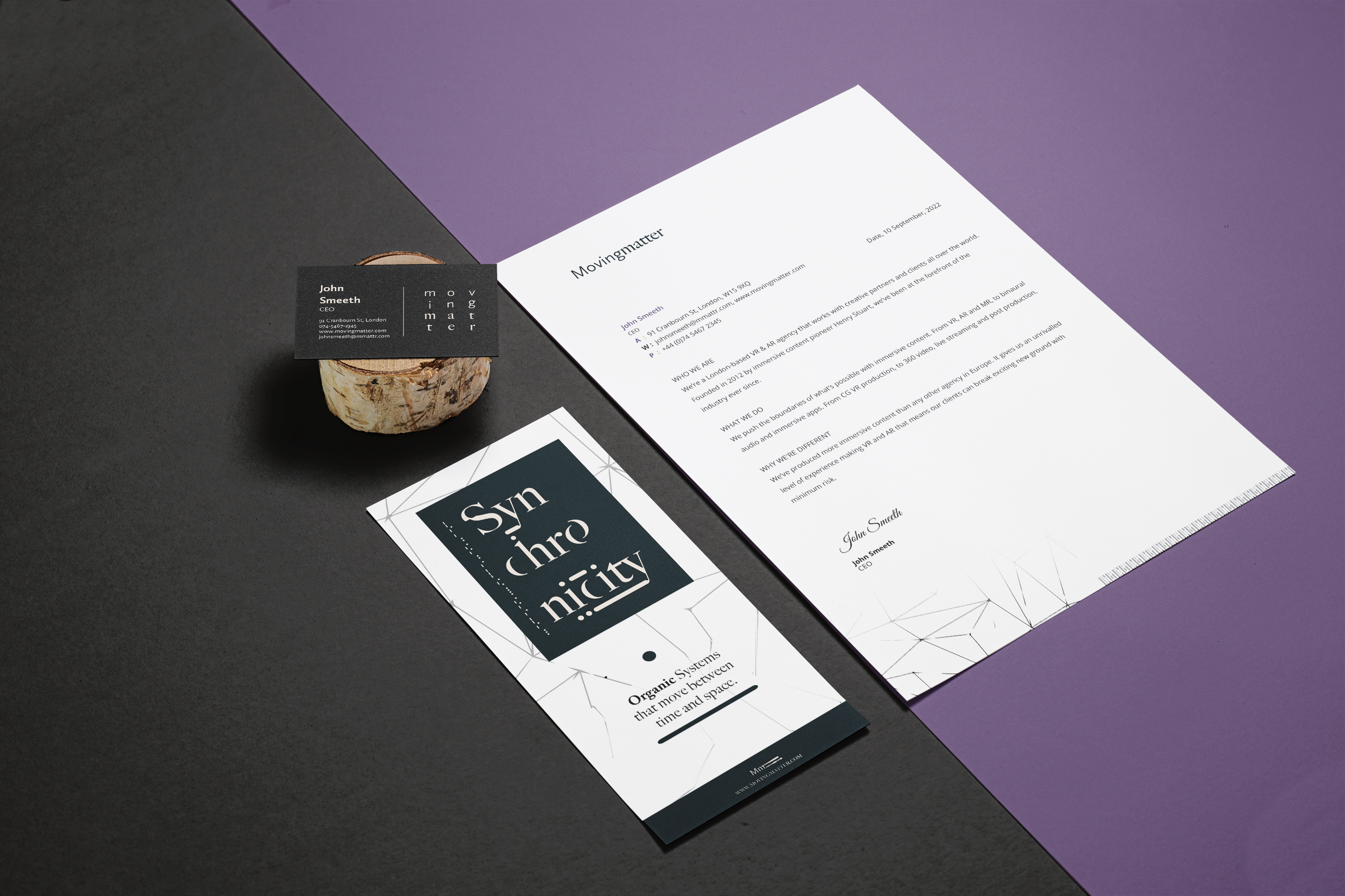
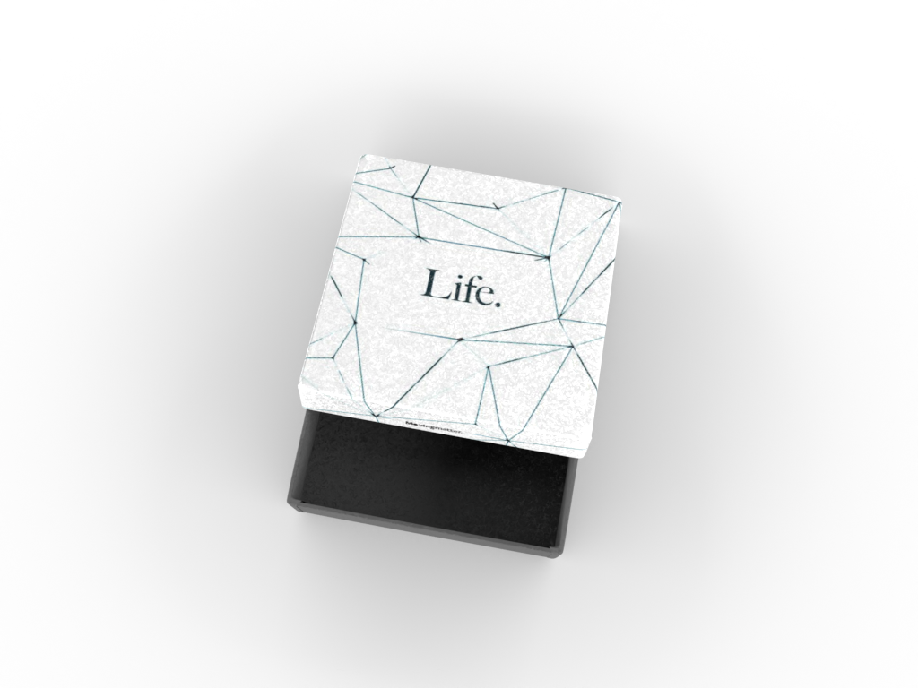
Moving Matter is an audio-visual studio based in London. They wanted to kick-start their branding with persona mood-board and logo that aligns with their vision.
Date
January 2023
Role
Branding, Web Design, Logo Design
[ View Website ]
Discovery
A set of prerequisites were determined during the discovery phase; they wanted a text-based logo that was easy to read, clean and represented the linear, tech driven persona of the brand. I created three different concepts for us to explore together.
Development
To showcase my design process, I’ve illustrated how I develop a primary idea by applying critical thinking. Drawing inspiration from Morse code and its fundamental principles of visual recognition.
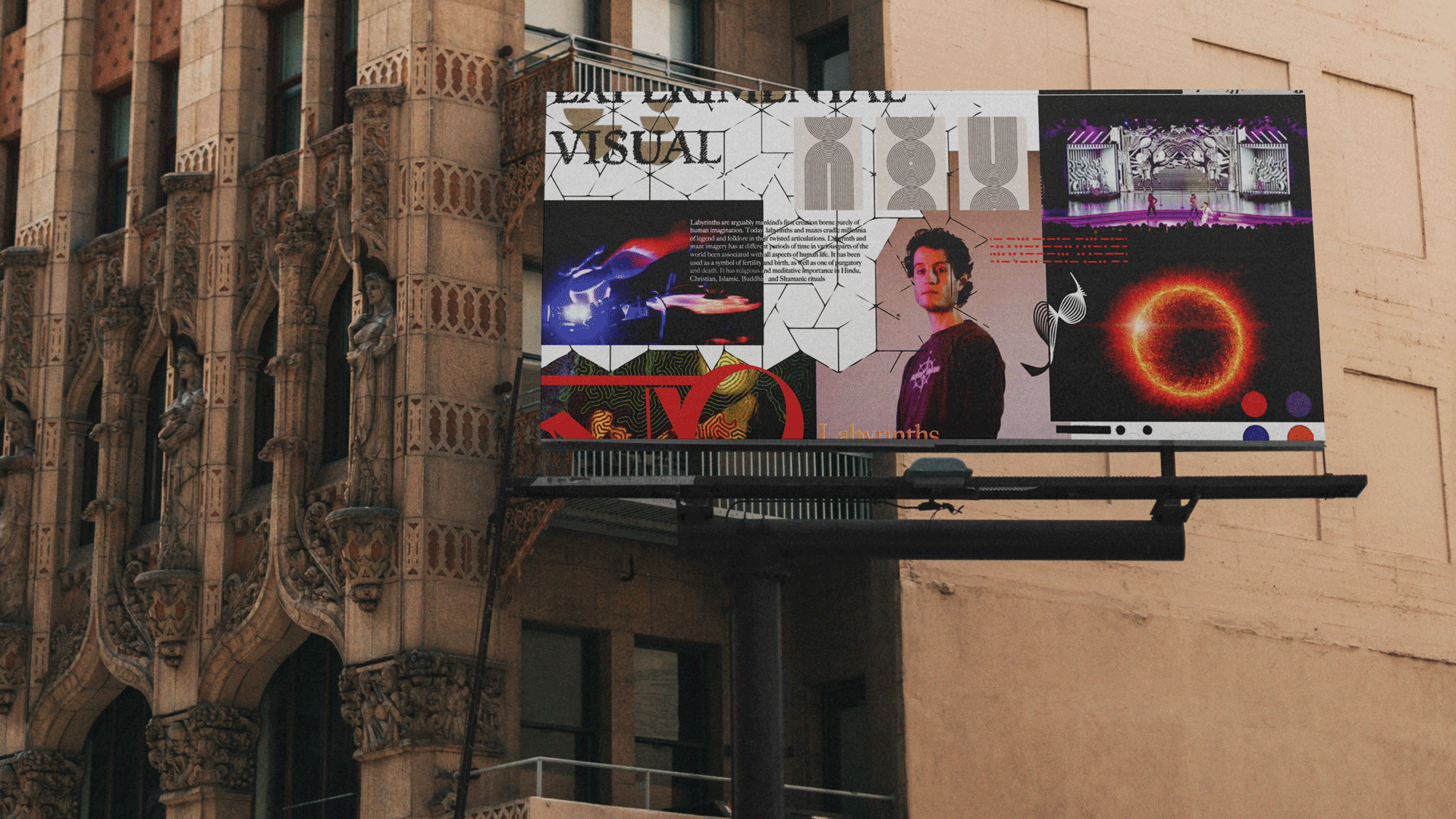
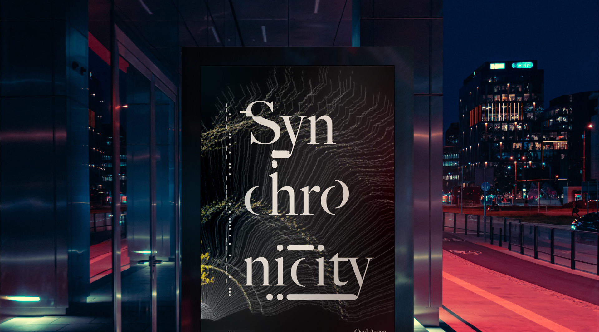
I worked with Moving Matter to capture the essence of motion, aligning with the brand’s name and identity. Knowing the logo would be used at both festivals and indoor venues, I ensured the client could see how it appears across various backgrounds and settings.
- Concept 1
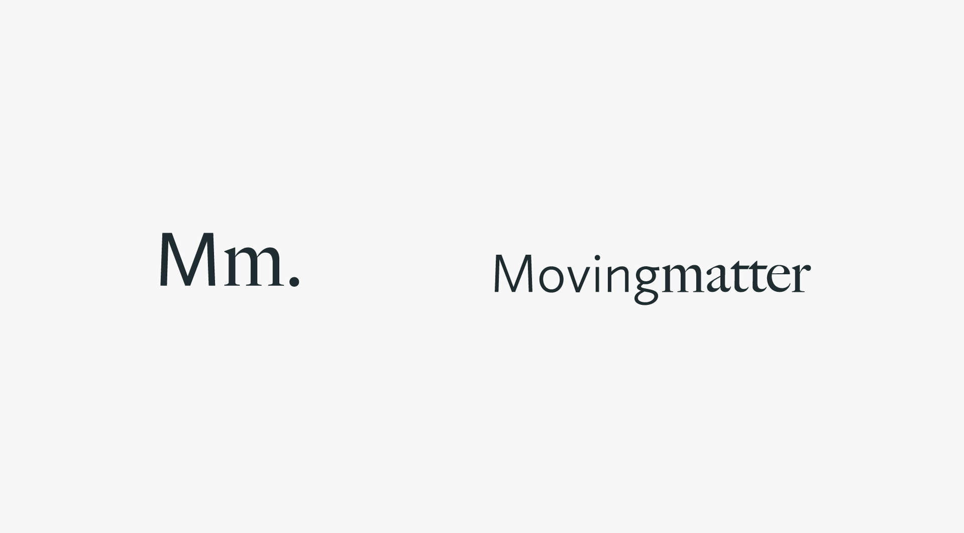
- Primed to easily capture the feel of new media and innovation with a modern element. The contrasting fonts create a dynamic relationship between modern and traditional, by bridging the gap in a nostalgic fashion. The monogram is ended with a period to mark the finality of the sound “Mm”
- Concept 2
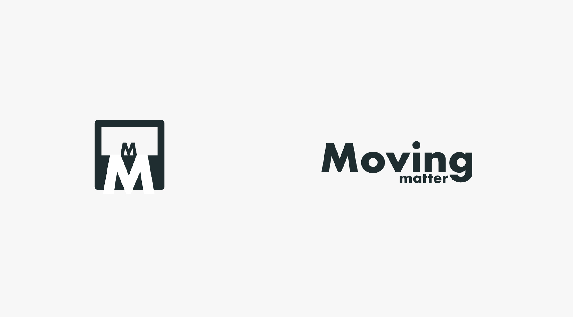
- Developed with the organic, familiar and comfortable attributes in mind. Containing the type into a box with one ‘M’ sitting above the larger negative one plays with the notion of moving between space
- Concept 3
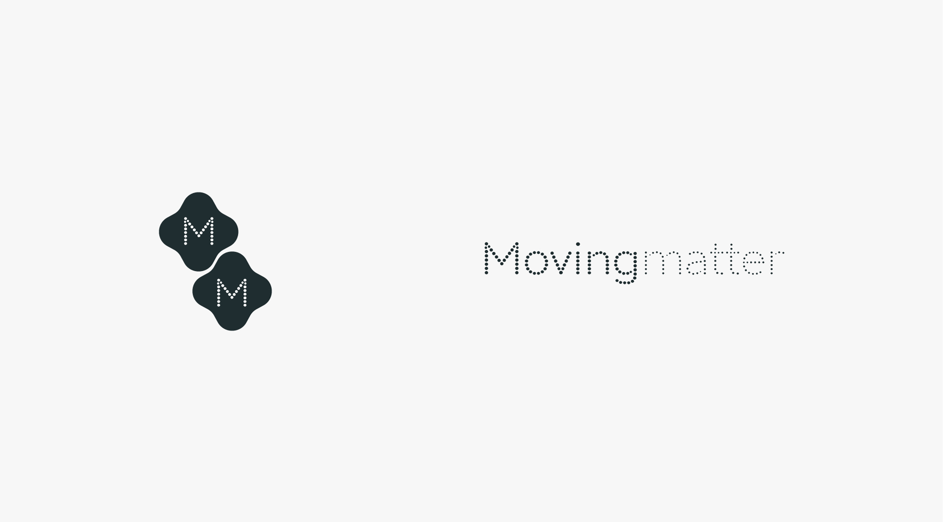
- Inspired by my personal interest in particle systems that are used in visual performances. The repetition feels harmonious and balanced but also structured. The intention for this concept was to drive forward the application of animation, considering it would be an accurate representation of their brand culture.
Results
This case study was an opportunity to explore the various facets of the brand and bridge the relationship between design and thinking. I offered a wide set of tools that could be used in specific formats as required, but also maintained and built upon the direction they wanted their brand identity to take. The logo is dynamic, clean and simple yet embodying evolution.


